Written By: Gloria Tsang, RD
Title: Founding Dietitian
Alumni: University of British Columbia
Last Updated on:
You’ve probably seen them – obesity maps, which show the levels of obesity across the country using color coding. It’s been a long time since the obesity maps in Canada were updated. The last versions were done way back in 1998. Recently, researchers at UBC released new, updated versions of the obesity maps based on information from the Canadian Community Health Survey (CCHS) over the period of 2000–2011. So what do the new obesity maps look like, and what do they tell us about how we’re managing obesity in this country? First, let’s look at the new maps.

Table of Contents
If you look at the maps for each of the years of the study, you’ll see that BC changed colour in 2008. That’s the first year we moved into the 20–24% obese category. You’ll also see that BC is the only province or territory to have been in the lowest category – 15-19% obesity – during the years covered by the survey. Obesity has been consistently high in some areas, particularly the Northwest Territories, Nunavut, and the Maritimes.
The UBC researchers also looked at the differences in the obesity rates between men and women. They found that overall, the obesity rates for men and women are similar across the country, except that women have lower rates of obesity in Ontario but may have higher rates in the territories.
According to Carolyn Gotay, the study’s lead researcher and a professor at UBC’s School of Population and Public Health, “More Canadians are obese than ever before – on average, between one fourth and one third of Canadians are obese, depending on the region.”
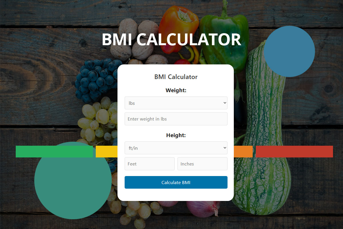
That’s a lot of us! The study defined obesity as a BMI of 30 kg/m2 or greater, which is the common definition of obesity. For reference, a person who’s 5’7″ and has a BMI of 30 would weigh about 190 pounds. Healthy BMI is in the range of 18.5–25.
What’s interesting is that things may be taking a turn for the better – or at least not getting any worse. Over the 11-year study period, the researchers found the greatest increase occurring between 2000 and 2007, with obesity rates essentially leveling off for the last four years of the study.
If you’re wondering how we compare to our southern neighbours, the latest obesity figures for the United States show that about 36% of Americans are obese – so we are catching up.
Tell us: What do you think about these updated obesity maps? What do you think we should be doing as a country to limit the rate of obesity? Let us know in the comments
Alumni: University of British Columbia – Gloria Tsang is the author of 6 books and the founder of HealthCastle.com, the largest online nutrition network run by dietitians. Her work has appeared in major national publications, and she is a regularly featured nutrition expert for media outlets across the country. The Huffington Post named her one of its Top 20 Nutrition Experts on Twitter. Gloria’s articles have appeared on various media such as Reuters, NBC & ABC affiliates, The Chicago Sun-Times, Reader’s Digest Canada, iVillage and USA Today.
bmi, canadian, lose that weight, obesity
What You Should Know About Milk When Shopping in the United States
Local Eating: Canadians are Willing to Pay Extra for Local Food

Like our content? Download our free shopping guide and the first chapter of the GoUndiet Book Now!


HealthCastle Nutrition Inc. · © Copyright 1997-2026 · All rights reserved